


When choosing colors for your senior portrait session, it’s important to consider a few factors. What colors do you love? What colors look great on you? The locations you choose and the overall aesthetic of your session should also be considered.
Here are some general guidelines to help you decide on colors for your senior portraits:
Neutrals: Neutrals like white, black, gray, and beige are timeless and versatile. They can create a classic and clean look that puts the focus on you and your expression. Neutrals also work well with various backgrounds and can easily be paired with different accessories.

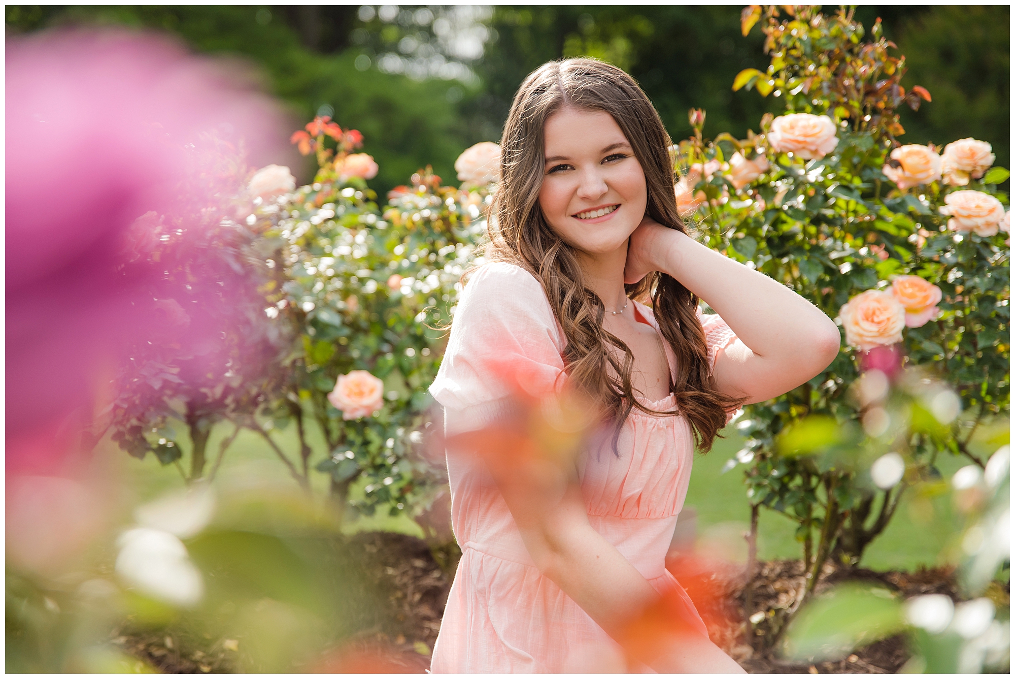
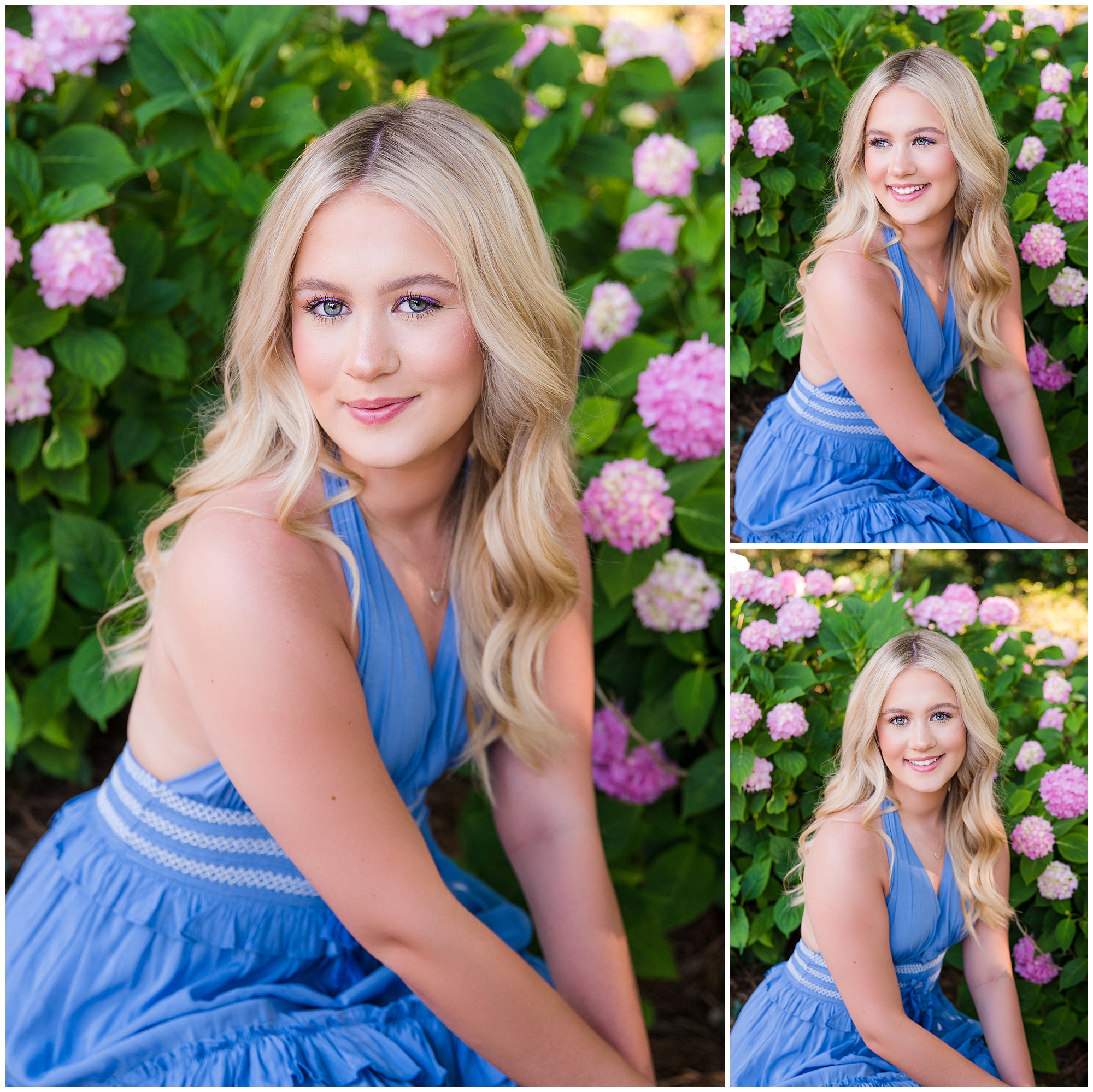
Pastels: Soft pastel colors like light pink, lavender, mint green, or baby blue can create a gentle and dreamy feel in your senior portraits. They work well in outdoor settings and can complement natural elements like flowers or greenery.
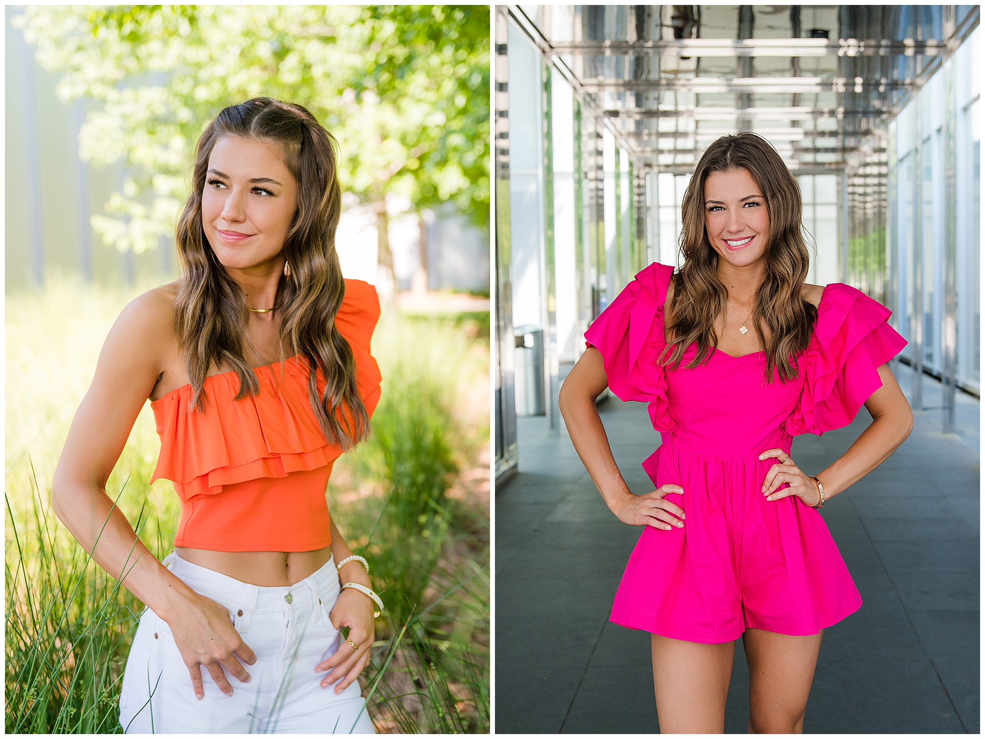
Bold Colors: If you want to make a statement, consider wearing bold colors that suit your complexion and personal style. Vibrant shades like hot pink, royal blue, emerald green, or deep purple can add a pop of color and create a visually striking contrast in your portraits.
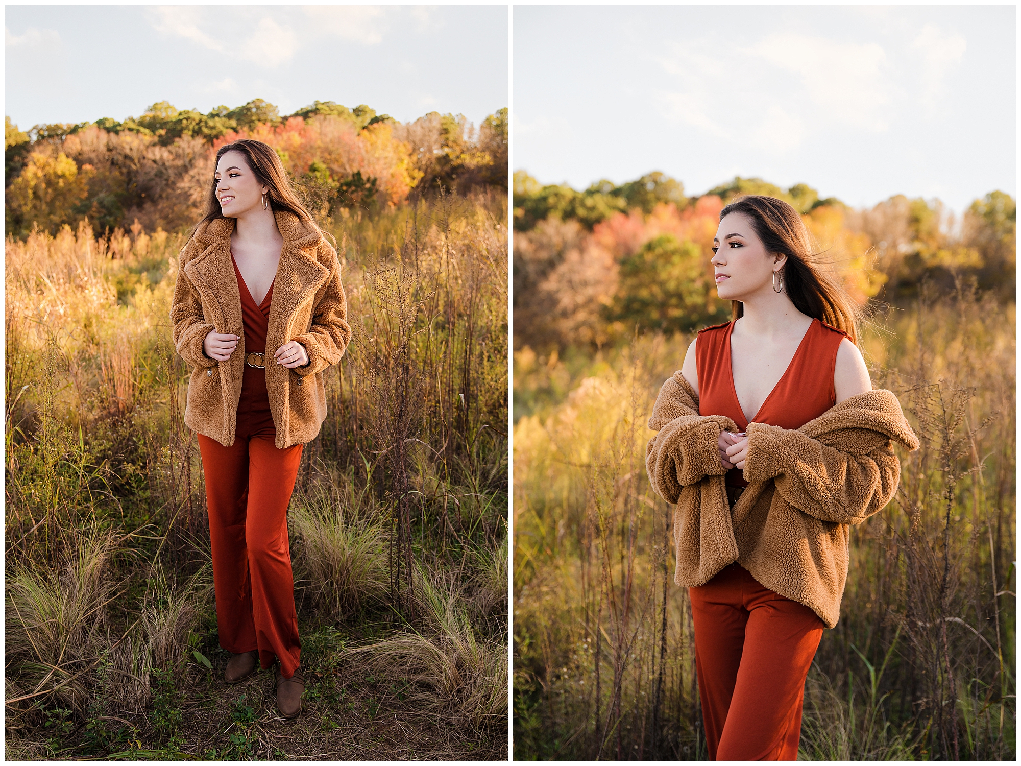
Complementary Colors: Consider the color wheel and choose colors that complement your skin tone and eye color. For example, if you have warm undertones (yellow or peachy), earthy tones like burgundy, mustard, or olive green can be flattering. If you have cool undertones (pink or blue), jewel tones like sapphire, amethyst, or emerald can work well.
Avoiding Clashing Colors: It’s generally a good idea to avoid wearing colors that clash with your surroundings or may distract from your face. Avoid wearing extremely bright or fluorescent colors that could reflect onto your skin or cast unwanted color casts.
Consider Your Background: Think about the location or backdrop of your senior portraits when selecting colors. If you’re shooting in a natural setting with lots of greenery, earth tones or soft pastels can complement the environment. For an urban setting, bolder colors or neutrals can work well.
Remember, these are just general suggestions, and the most important factor is to wear colors that make you feel confident and reflect your personal style. When we are planning your session, we will discuss your outfits and make sure they will work with your location. I will pair up your outfit with the backdrops that work best with your chosen oufit!


